

For an entrepreneur, a professional online appearance is essential. In your content marketing and your social media statements, especially visual content plays an important role. We’re so lucky to have Canva!
Canva is a free online tool that allows you to create the most original and professional designs for your marketing in no time. To get even more out of Canva, I share 14 practical Canva hacks in this blog that will help you design all your marketing materials in an even more professional and original way.
What is Canva?
Canva is a handy online tool that takes a lot of (thinking) work out of your hands. The free version already includes countless beautiful templates and useful elements that you can perfectly use for your business.
Your target group
1. Remember who you are designing for
As an entrepreneur, it’s tempting to be guided primarily by your own tastes, when looking for inspiration on Canva. For example with the existing templates. That’s why it’s always important to put yourself in the shoes of your ideal client while scrolling through the templates. Because you want your content to stand out and appeal to your target audience.
So, put yourself in the shoes of your ideal customers and ask yourself: what type of images appeal to them most? What fonts go with it? Also, think carefully about what you want to radiate or convey per design. For example, is it tranquility or energy? With all the elements that you can use on an image, you should take into account what you want to convey: the image, the fonts, and the amount of text. But also the colors.
2. Use your own photo material
People do business with people. So your ideal customers want to know who they are dealing with before they will buy anything from you. Everything you do, say or write affects your ideal customers. Know that they will like you, your business, and your products if you are authentic and personal.
If you choose to use images with people on it, make sure you use photos that show your real self. Stock photos with perfect models say little or nothing about who you are. Such an image does not contribute to the image of you and your business.
For all other images, it is also advisable to use your own photos. For example, is it almost Christmas? Take beautiful pictures of all the decorations in and around your house. The Christmas tree, the Christmas lights outside, the Christmas cards you received, or the beautiful Christmas arrangement. This way you will have original photos that you can use for your designs during Christmas.
General
3. Go for contrast
Contrast is very important for a design and often a nice effect can be achieved with it. With a good contrast the eye of the viewer is automatically drawn to your image. Make sure you include contrast in your design to emphasize a certain element in your design. This can be done by using elements with opposite characteristics such as color, thickness or shape to make a specific element stand out.
I’ll give you a few examples:
- Make use of the different options in fonts. Don’t be afraid to use bold or italics more often. Or change the font size of certain words. Make sure that specific words stand out and the reader is automatically drawn to them.
- Use colors that contrast but remain legible. Think black and white or green and yellow. You may understand that dark blue and purple are difficult to combine because they are both dark.
- Adjust the color or brightness of the background. This is a commonly used effective way to add contrast to a design. For example, place light-colored text on a dark background or vice versa. This works especially well with text because it makes it easy to read and stand out clearly.
- Do you have an image with many different colors on the background? It’s often difficult to put readable text on it. Slide the text over the image and find a place where the text contrasts best with the background color. That’s the spot it will be best readable on. You can also change the color of the text. If the background is quite dark, turn your black letters into white ones and they will immediately stand out more.
In short: contrast makes your design stand out and ensures that certain elements stick in the mind of the viewer. Do this in moderation though: see what fits best for each image.

4. Use your (white) space optimally
Just as fewer colors and fewer different things on your image create more tranquility and a professional look, so does the (white) space on your image.
This does not always have to be an empty space with a white background. It can be in any color or pattern, as long as it is a space where you have no elements. This can be the space between lines of text or paragraphs, or around elements or images.
This is an example of a design with many elements, but still space around each (cluster of) elements or text.
Think about the space between the letters, below and above your letters, and the space between the edge of your image and your letters. Is there enough space or does it look a bit crowded?
The use of space does a lot, optically, so make the best use of it. You can test the effect by varying a bit. Pull the letters further apart and also the distance between the lines and see what it does. Choose the distance that radiates tranquility and professionalism.
5. ‘Less is more’
A tool like Canva makes it very tempting to fill a design with images, text and elements. Be careful with this: because less is more. Optically busy images can subconsciously deter. For example, if you use many colors or added elements.
Make sure you create several calm-looking designs and focus on one aspect per design, such as the text.
Ninja tip: Not happy with a created design? Maybe there is just a little too much in it. Then take out a part of it. For example, a certain element. Or reduce the size of an image. You can also replace an image with a similar image: for example with fewer colors. Try some things out,until you have found the right combination.
HELPFUL TRICKS
6. Professional Filters
Did you know that Canva has several professional filters that you can easily try out and use? This way you can edit all your photos in the same style for an extra bit of personalization.
This is how you do it: select the relevant photo in your design. Then click on ‘Filter’ at the top.
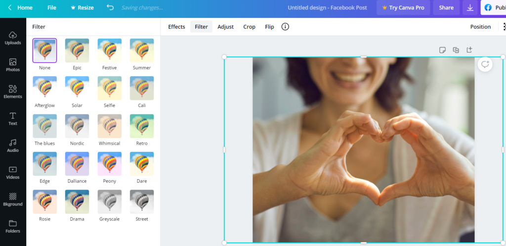
There you will see all kinds of filters that you can immediately put over the photo by clicking on them. Remember the filter you chose. It is wise to add that filter to all your images for an extra professional look.
7. Play with shapes
Sometimes all you need to make your design shine is a nice shape. For example, to put your quote in it. Canva has a lot of shapes you can use.
You can find them in the menu on the left. From there, click on ‘Elements’ and scroll until you see ‘Shapes’.
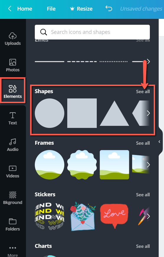
You have a choice of all kinds of forms available.
Choose the desired shape and start working with it. You can give the shape a different color or insert a text area, for example a quote.
Ninja tip: It is also fun to place a shape over an image. You can then make the shape color more transparent, so you can still see the photo on the background through it. You can then place text in the shape. For example, the title of your blog.
You can make the shape more transparent with the second icon at the top.
![]()
Select the shape and then click on the icon. The slider allows you to set the degree of transparency.
8. Ready-made background
Do you want to quickly use a neutral background, but with a little color or shape? Then take a look at the “Background” option. You’ll find it in the menu on the left.
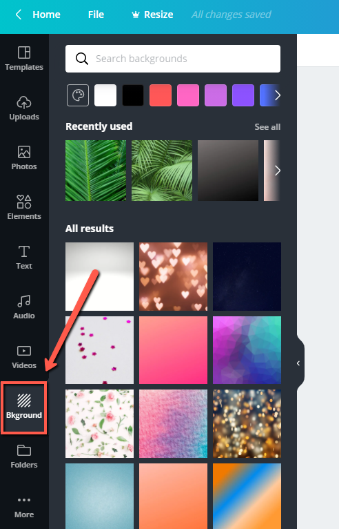
You’ll see all kinds of backgrounds to drag and drop into your design. Ideal as a background for a quote or any other important text that needs to stand out.
Would you like to get started at lightning speed with all the possibilities of Canva? Then join me in ‘In 30 Days a Canva Star‘. You can already participate in this Canva course for an extra low introductory price. Are you in? https://www.365daysofsuccess.com/canva/
COLOR
9. Use colors from your favorite image
The Color Palette Generator is a free tool from Canva ideal for finding great colors and color combinations for your designs.
It allows you to upload a photo that you find inspiring and beautiful or whose color combination you like.
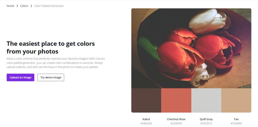
Click on ‘Upload an image’. Below the image you will immediately see the four most common colors used in that particular image. Very conveniently, you can get the color codes right away.
You’ll see them listed directly below the color patches. So you can start using the colors you want yourself by entering these codes in the color selection.
Convenient: to use this feature, you don’t even need to be logged in to Canva.
10. Discover professional color combinations
Canva gives you another option to discover professional color combinations. This helpfuloption is in Canva itself. It is the color palette. You can find them here.
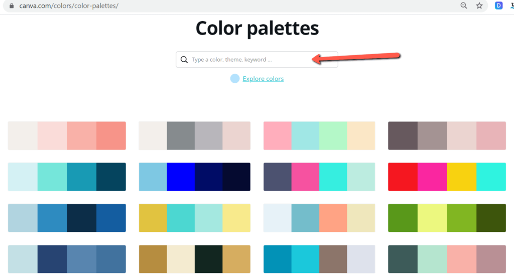
This is a great selection of ready-to-use color combinations that you can use right away. There are a lot of them. Fortunately, you can also search for specific colors or search by theme or keyword. Maybe you are looking for earth tones, type in the keyword “earth”.
The advantage of this is that you get to see what you can combine well. The suggested combinations are often also in line with current trends so you’re always on the right track in terms of color choice.
11. Change the color of multiple elements at once
Sometimes you want to change the color of several elements in your design at once. If you have to do them separately, it takes quite some time. It can be done faster. In your design, go to an element (for example, a text) and give it the color you want via the color button at the top.
If you now scroll down in the color menu, you will see ‘Change all’:
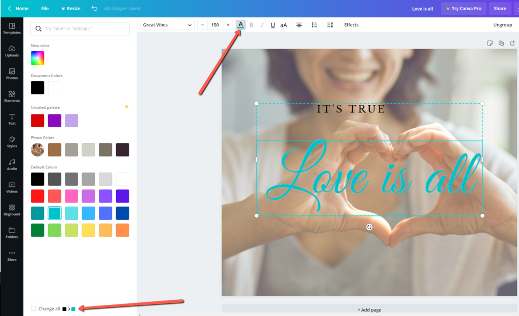
In this case, all green text will be changed to black.
This way you can change everything to the desired color with one mouse click if you check the option at the bottom.
IMAGES
12. Using part of an image
If you want to use only part of an image, you can select it easily. iT does not work by selecting the image, grabbing it in the corner and making it smaller. Because then you reduce the size of the entire image.
You can achieve it by selecting the image in your template and then pressing the ‘Shift’ key on your keyboard. Now if you make the image smaller by dragging, you will cut the image, so to speak, and the proportions of the image will remain the same.
13. Using letter templates
Do you want to get creative with words? This is also possible in Canva. There are several designs in the form of letters. You can use the characters creatively. For example, you can turn them into words and ‘fill’ them with your colors, with beautiful patterns, or even with (parts of) images.
To find them, go to ‘Elements’ in the menu on the left. Then go to the search bar and type in ‘Frames’.
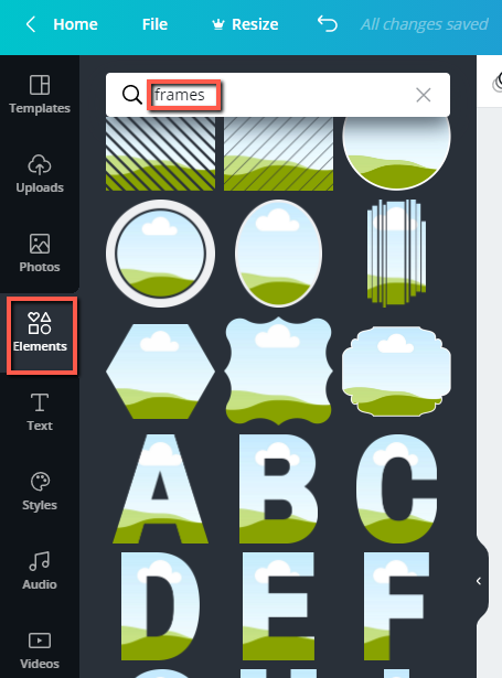
Scroll down a little and you’ll see the letters listed. Select the letters you want to use and place them in your design.
14. Using grids
Do you want to add several images in one design? You can use grids to arrange them nicely. In Canva, you will find many grids that you can easily drag into your design and use right away.
You can find the grids by going to ‘Elements’ in the left column (the menu). There you will see the option ‘Grids’ next to it.
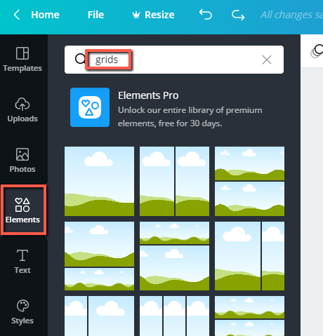
Have you chosen a grid? The only thing left to do is to drag the images to it. You can also change the size of the grid in your design.
As you see, there are endless possibilities to create original and professional designs for free in Canva. Try them out the next time you use Canva for your business. Good luck!
Are you interested in Canva Pro? Then you can test the tool for free for 30 days. You can sign up here: https://www.canva.com/nl_nl/pro/
Do you want to save these Canva hacks? Download the ebook:
